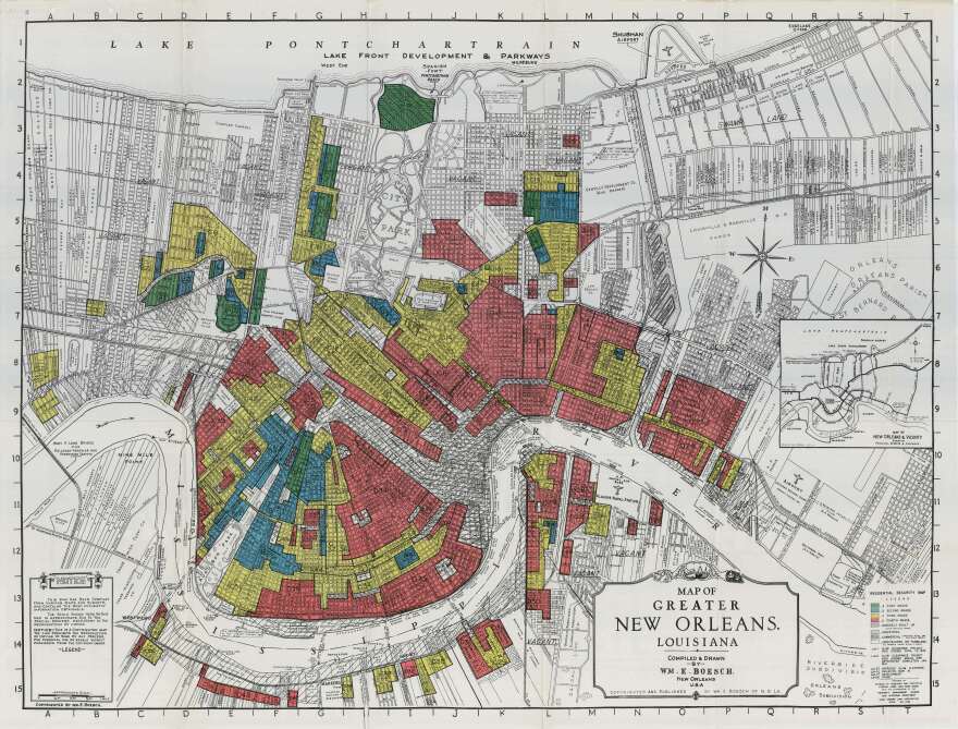
In the aftermath of the Great Depression, the U.S. government set out to evaluate the riskiness of mortgages — and left behind a stunning portrait of the racism and discrimination that has shaped American housing policy.
Now a new digital tool makes it easier than ever to see that history in high-resolution.
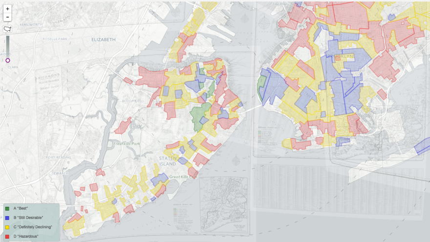
The project features the infamous redlining maps from the Home Owners' Loan Corporation. In the late 1930s, the HOLC "graded" neighborhoods into four categories, based in large part on their racial makeup. Neighborhoods with minority occupants were marked in red — hence "redlining — and considered high-risk for mortgage lenders.
Redlining was carried out in cities big and small, with the help of local realtors and appraisers. The maps and descriptions eventually made it into the National Archives.
A newly revamped interactive site from "Mapping Inequality" takes scores of HOLC maps — previously accessible only in person at the Archives or in scanned images posted piecemeal online — and embeds them on a single map of the USA. Selecting a city reveals the old map images; zooming in shows a color overlay over a modern map with street names and building outlines.

A team of scholars at four universities took seven months to build the project. More than 150 cities are included in the map, which was released last week to replace a version with fewer features. A key element of the new map is that many neighborhoods include the reasonthey were classified the way they were.
If you see that a neighborhood was redlined, ranked as "desirable" or fell somewhere in the middle, just click and you can find out why. "Infiltration of: Negroes" is a common fill-in-the-blank item explaining why a region was deemed hazardous.
"Respectable people but homes are too near negro area," reads a summary for a B-grade neighborhood in Richmond, Va.
"This is considered the most exclusive, or swank, section in Springfield," says the entry for one of the city's two A-classified neighborhoods. "The area is high restricted" — meaning it enforces strict rules barring non-white people from buying houses there.
Robert Nelson, director of the Digital Scholarship Lab at the University of Richmond, co-designed the map. He says one entry in particular stands out for him as shocking: a spot in Camden, N.J., where a D-graded neighborhood abuts an A-grade, an unusual situation.
"It is 100% poor class Negroes practically all on relief," the "clarifying remarks" for the redlined neighborhood read. "A high wall, however, prevents their spread."
Another neighborhood in Camden, mostly occupied by Polish professionals, was graded "declining," one step above a redlined neighborhood. "Negro district on edge of section," the description reads, "but splendid cooperation of all residents in this section will always prevent spread."

Redlining followed what Nelson, crediting his colleague for the term, calls the "one-house rule" — like the "one-drop rule" for racial identity. Under the "one-drop rule" in the 19th and early 20th century, a single drop of African-American "blood" made a person black, even if their heritage was overwhelmingly white. Similarly, on redlining maps, a single black household in a middle-class area could make the whole neighborhood "risky" for mortgage loans in the eyes of the federal government.
As a result of redlining, families of color "couldn't avail themselves of what is arguably the most significant route to family and personal wealth-building in the 20th century, which is homeownership," Nelson said.
Redlining is frequently cited by scholars examining American inequality, and it was highlighted by Ta-Nehisi Coates in his "Case for Reparations" in The Atlantic.
"Neighborhoods where black people lived were rated "D" and were usually considered ineligible for FHA backing," he wrote. "Black people were viewed as a contagion. Redlining went beyond FHA-backed loans and spread to the entire mortgage industry, which was already rife with racism, excluding black people from most legitimate means of obtaining a mortgage."
Without access to FHA-insured mortgages, he writes, black families who sought homeownership were forced to turn to predatory and abusive lenders.
Coates focused on redlining in Chicago, but — as is immediately obvious on the Mapping Inequality site — redlining was carried out across the country.
Nelson says he hopes the new tool will prompt some conversations and soul-searching among the general public. "People don't know about this history and I really wanted for them to wrestle with, grapple with, talk about, think about the racial and wealth inequalities in 20th-century America — and particularly the federal government's role in creating that," he says.
The next step is to start crowd-sourcing the transcription of the files — so that anyone can help turn the scanned (and sometimes hard-to-read) images into searchable text. A team is currently working on building a feature to make that possible.
Nelson said he could hire grad students to do that work, but he'd much rather see everyday citizens contribute for their own city, learning about their region's past as they type up the old descriptions.
"What I hope people get out of that is that they experience what I experience," he says. "I've been looking at these things forever, but every once in a while, I stumble upon something startling and it changes the way I think about American cities and inequality."
Copyright 2021 NPR. To see more, visit https://www.npr.org. 9(MDA1NTMzNDA4MDEyNzk4MTU2OTg2ZjAyZQ004))


